People usually see the final version of a clothing collection.
The photos. The campaign. The lighting. The dramatic music in the background of the launch reel that somehow makes folding a t-shirt feel cinematic.
What they don’t see is the chaos before it. Hundreds of bad ideas. The designs that looked incredible at 2AM and deeply concerning the next morning. The fabric samples arriving in shades that can only be described as “disappointing corporate charcoal.”
The First Sin started long before the first piece was made. It began with a feeling to build a label that is not made to fit in.
We knew we didn’t want our first collection to feel like random designs placed on oversized tees just because that’s what streetwear brands are expected to do now. We wanted the collection to feel connected, like a world instead of products.
That’s where the concept came from.
“The First Sin” wasn’t created around religion or controversy. It was built around transformation. The moment people stop being the version of themselves designed by others and start becoming who they actually are. That idea shaped everything.
The silhouettes had to feel structured but relaxed. Oversized, but intentional. We spent an unhealthy amount of time obsessing over proportions because oversized clothing can either look elevated or look like you borrowed your older cousin’s t-shirt during a family function. Honestly, there’s very little middle ground.
Fabric became another obsession quickly. We wanted heavyweight high-GSM material because good streetwear should feel substantial. A premium oversized t-shirt should hold shape, fall correctly on the body, and survive more than two washes without emotionally collapsing.
People underestimate how much fabric changes confidence.
You wear something structured and suddenly your posture improves like your ancestors are watching.
The colour palette was intentionally restrained too. Mostly blacks, dark neutrals, muted tones. Not because we think colours are illegal, but because darker palettes create permanence. Trends come and go, but black always returns. It sharpens silhouettes. It creates mood. It feels cinematic without trying too hard.
That mattered to us.
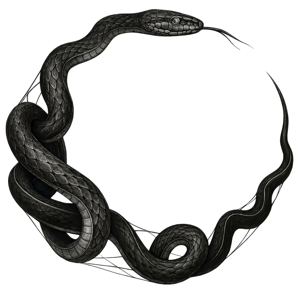
The graphics and symbolism were approached carefully as well. We didn’t want meaningless visuals added for decoration. Every element had to connect back to identity, duality, rebellion, transformation, or cycles of becoming. That’s why symbols like the ouroboros, the serpent consuming its own tail became important references during the creative process.
The snake represents constant evolution. Destroying old versions of yourself to create new ones. Which honestly felt painfully accurate while building this brand because nobody talks enough about how emotionally strange creating something from scratch can be.
One day you feel unstoppable. The next day you’re questioning fonts for three consecutive hours while surviving entirely on caffeine and blind optimism.
But somewhere inside that chaos, The First Sin slowly became real. Not perfect. Not manufactured to please everybody.
Just honest.
That honesty mattered more to us than making something trend-driven.
We wanted the collection to feel lived in. Clothes that become part of people’s routines instead of temporary “statement pieces” worn once for Instagram and forgotten immediately after.
Because the best clothing usually becomes personal. That emotional permanence became the real foundation of The First Sin.
Looking back, the collection was never just about fashion.
It was about identity, transformation and quiet rebellion. The uncomfortable process of becoming yourself.
And that process my friends, is neverending.